What I Read Last Week
Gastric cancer prevention, the rising risk of a cancer diagnosis, 0, 1, or 2 mastectomies, and the use of race and ancestry in medical decision making
I’ve got a pretty stable approach to reading the medical literature. I even have a talk, “keeping up on the literature.” I have the JAMA, NEJM, and JAMA IM email me their TOC. I then use my other “media” – NYT, NPR, twitter, office chatter – to find other articles I should be reading. Last week, there were no articles that changed my practice but there were a few that I found interesting. No deep analysis here, just some thoughts.
My favorite article of the week was Gastric cancer prevention by community eradication of Helicobacter pylori: a cluster-randomized controlled trial. This article was published in Nature Medicine. It was an amazing study. Over 180,000 people in 980 villages in China were enrolled. All had urea breath tests for Helicobacter pylori, the bacteria that causes most peptic ulcer disease and is closely associated with gastric cancer. People that tested negative were followed. Those who tested positive received either curative H. pylori therapy or a PPI, depending on the random assignment of their village. The follow-up was 11.2 years.
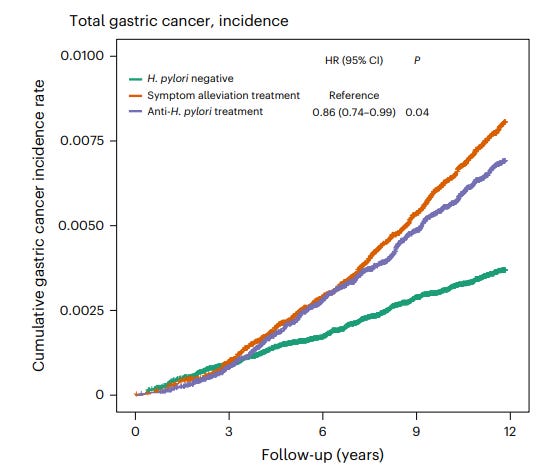
The results were striking. Gastric cancer developed least in those not infected, followed by those who received curative therapy, followed by those with untreated H. pylori. Here is the most important graph.
Compared to people who only received a PPI, the HR for those who received anti-H. pylori therapy was 0.86 (95% CI 0.74 – 0.99) for developing gastric cancer. The absolute risk reduction comparing (successfully) treated patients and untreated patients (per protocol here) was 0.55%. H. pylori negative patients had lower overall and gastric cancer related mortality. Mortality did not differ between the treated and untreated groups.
Might we eventually have a “screen and treat” approach to H. pylori in populations at high risk for gastric cancer?
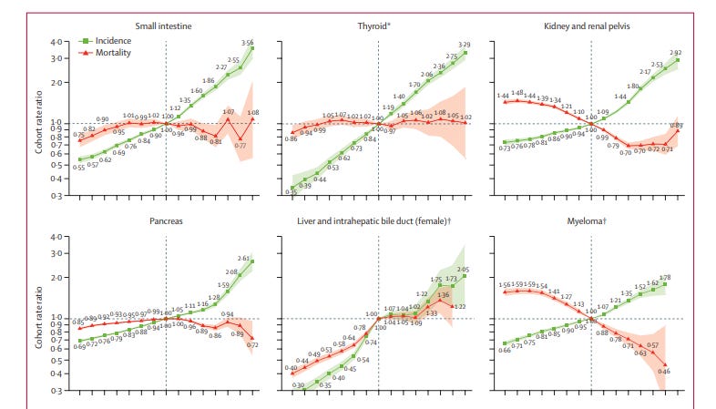
The next article is one that got a lot of play in the media (both traditional and social): Differences in cancer rates among adults born between 1920 and 1990 in the USA: an analysis of population-based cancer registry data. This article was published in Lancet Public Health. If you thought the numbers in the last study were impressive, wait for these. The authors obtained incidence data for 34 types of cancer and mortality data for 25 types of cancer for individuals aged 25–84 years for the period Jan 1, 2000, to Dec 31, 2019 from the North American Association of Central Cancer Registries and the US National Center for Health Statistics, respectively. Data was abstracted for 23,654,000 (!) patients diagnosed with 34 types of cancer. Plotting incidence vs. birth cohort the authors found increasing risk of many cancers going from the older cohorts to the newest ones. Here is a sampling of one of the graphs.
These could be frightening results, if not for the mortality, included in the same graphs, which suggests overdiagnosis rather than a combination of increasing incidence and improved therapy. The authors propose many different causes for the increasing incidence of many different cancers. I prefer the simpler explanation of overdiagnosis. I recognize my priors might be influencing my analysis here.
Many people compared this article to a classic 2019 NEJM article: Epidemiologic Signatures in Cancer. I do think the NEJM article did a much better job addressing the causes of what we are seeing. (If you haven’t read this article, it is really worth your time.)
If that article disappointed me, I thought Bilateral Mastectomy and Breast Cancer Mortality was particularly sharp in its analysis and provided us with data that not only improves our understanding of science but also helps us counsel patients. This observational study was published in JAMA Oncology and compared the 20-year cumulative risk of contralateral breast cancer and breast cancer mortality among women with stage 0 to stage III unilateral breast cancer according to the type of initial surgery performed: lumpectomy; unilateral mastectomy; bilateral mastectomy.
After matching, there were 36, 028 women in each of the 3 treatment groups. During the 20-year follow-up, the results, shown in the table below, demonstrated that bilateral mastectomy decreased a woman's risk of contralateral breast cancer (though not to zero) but did not change breast cancer related mortality.
Before reading the article closely, I assumed that the results reflected the fact that our treatments for breast cancer have gotten so good that it is less important to prevent a breast cancer as it is to treat it well. A closer look, reveals that the issue is that a subset of early stage breast cancers have already spread at the time of diagnosis and that more aggressive local therapy does not change the outcome in these women. The authors, I think rightly, state:
The findings… (of) our study suggest(s) that early detection of contralateral breast cancer may not be an effective means of reducing mortality. Furthermore, if preventing contralateral cancer is not an effective means of mortality reduction, it is unlikely that screening post diagnosis would be effective.
The clear take-away is that for a woman similar to those in this study, the decision to undergo bilateral mastectomy might be reasonable if the goal is to prevent having to go through the trauma of another breast cancer diagnosis. If the goal is to reduce the overall mortality from breast cancer, bilateral mastectomy is not warranted.
The fourth article appeared in the NEJM. It was not a study but an essay in the Medicine and Society section: Race-Based Screening under the Public Health Ethics Microscope — The Case of Prostate Cancer. This article is just worth a read and a ponder. I wonder if we are at the point that what has become acceptable in medicine – and is mostly correct – occasionally works against us. Has perfection become the enemy of the good, or has perfection won out over pragmatism.
The two conflicting forces discussed in this article is that we have accepted that “race is a social construct.” To argue against this in polite, academic medicine company is to risk censure. We also accept that “ancestry” is important. Over the last 50,000 years, humanity has evolved. People whose ancestors come from different parts of the globe, with different seeding and selection pressures, have different distributions of genetics and disease. Think of lactose intolerance, sickle cell disease, multiple sclerosis, BRCA mutations, Tay Sachs. You can google maps of the prevalence of HLA-B27 in the population.
Race and ancestry overlap, but they are not the same thing. This is a good primer on the topic.
This NEJM article looks at the sticky situation of prostate cancer in the US. The article notes:
In the United States, self-identified Black men have the highest prostate cancer incidence and related mortality and are almost twice as likely as self-identified White men to die from the disease. Conversely, self-identified Asian American men have the lowest incidence and mortality. Men who identify as Hispanic or Latino have prostate cancer incidence and mortality similar to those of non-Hispanic White men. However, self-identified Hispanic men are 54% more likely to be diagnosed with metastatic disease at the time of presentation, and in this group, those who identify as Hispanic Black face the highest risk of metastatic disease. Given these differences, it’s not surprising that the question of whether to include race or ethnicity in risk assessments for screening has become a public health issue over the past decade.
The article asks whether we should ignore this data because the cause of the disparities is societal rather than biological and that enshrining it into guidelines and algorithms may introduce bias. Or, they ask, can we, intelligently, utilize it. Probably, from the way I introduce this, you can tell where I come down. Give the article a read and decide for yourself.
Writing a piece like this reminds me of the transcendently good weekly summaries of the medical literature Richard Lehman once wrote. I could write these every week for the next 50 years and never approach his balance of pith, wit, insight, and intelligence. I learned so much from him. He used to finish with a botanical note. In his honor, I will finish mine with a baseball factoid.
Ichiro Suzuki’s batting average hit .300 in his 10th career at-bat. For the remainder of his playing days, his career average never fell below that mark.


Thank you, Dr. Cifu, I enjoyed the post.
This was great! Is this a new thing, cuz I don’t recall seeing this before. I read TWIC by Dr. Mandrola religiously, but no longer have the time/energy/inclination to keep up with GIM literature, so a series like this would be a welcome update. This could become “TWIGIM”.
The longitudinal cancer study is interesting. The y axes is log scale, so those 6 types of cancers in the included graph here have actually exploded in incidence. But before we infer “increased (unnecessary) diagnosis” vs “improved treatment” to account for those generally flat mortality curves, we need to know if effective treatments have in fact been developed over the timeframe, for each of those cancer types (by organ system, let alone cell type). And I don’t know the answer to that.